Ép Phê Brand Identity
Ép Phê is a boldest new destination for Vietnamese-style coffee and freshly-pressed sugarcane juicery in NYC.
The brand name is a clever double entendre, fusing the word Ép (“nuớc ép”—juice) and Phê (“cà phê”—coffee/euphoria). In Vietnamese slang, Ép-Phê also carries the meaning of hitting that total sweet spot that is an unmistakable rush of satisfaction combining with the sensational flavours that defines the brand’s unapologetic spirit.
Ép Phê Brand Identity
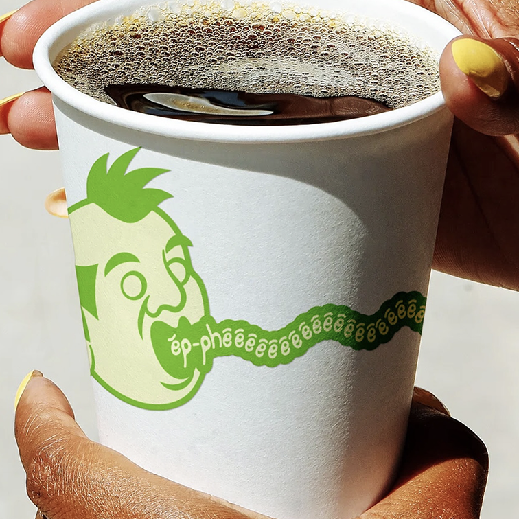
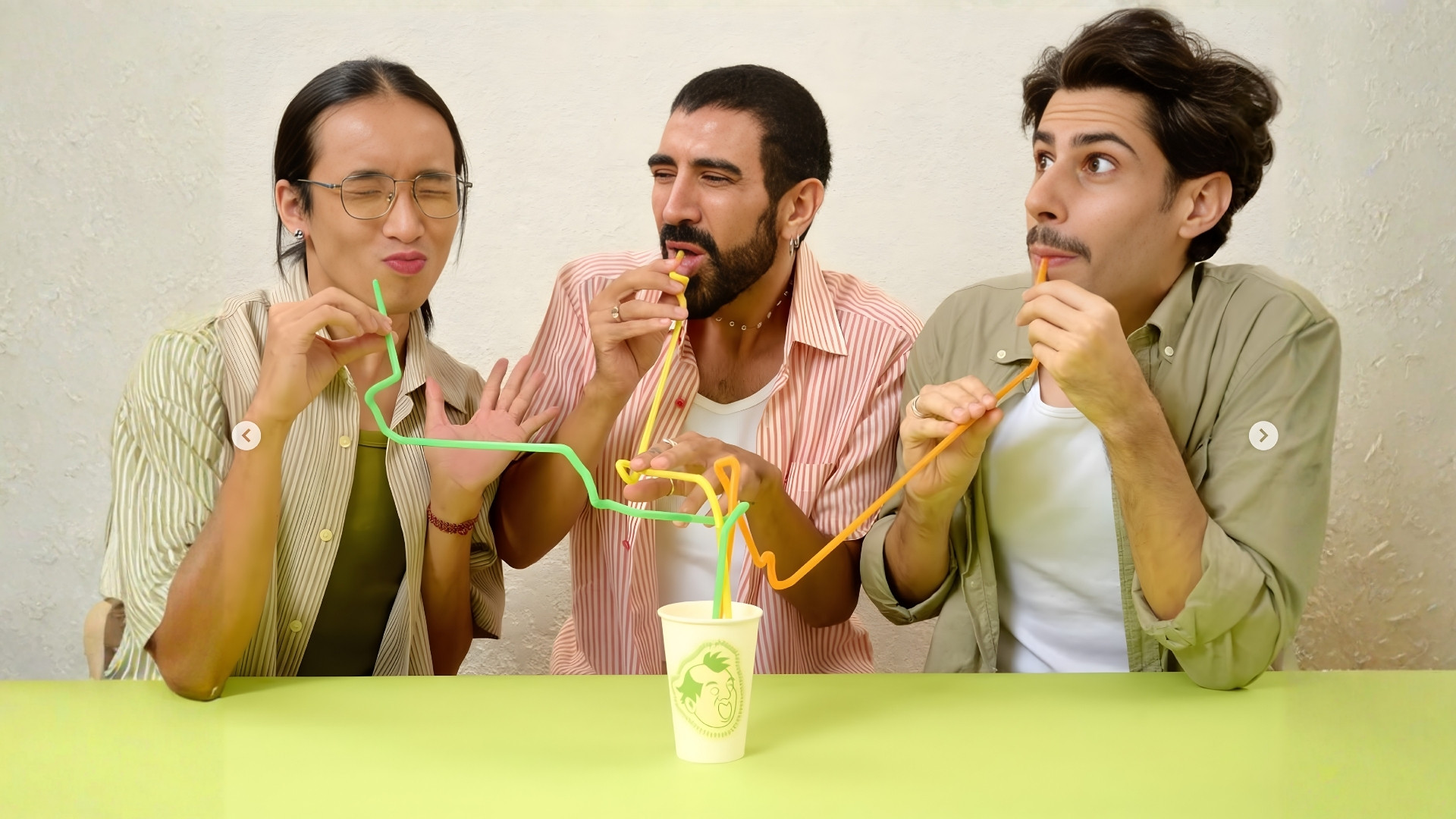
Rooted in the vibrant, chaotic melting pot of New York City, the visual identity celebrates the metropolis in all its wild and authentic glory. We illustrated various portraits capturing the city’s peculiar yet eccentric residence frozen in mid-euphoria in order to reflect the brand’s one and only mission: delivering an absolute taste orgasm straight to your palate.
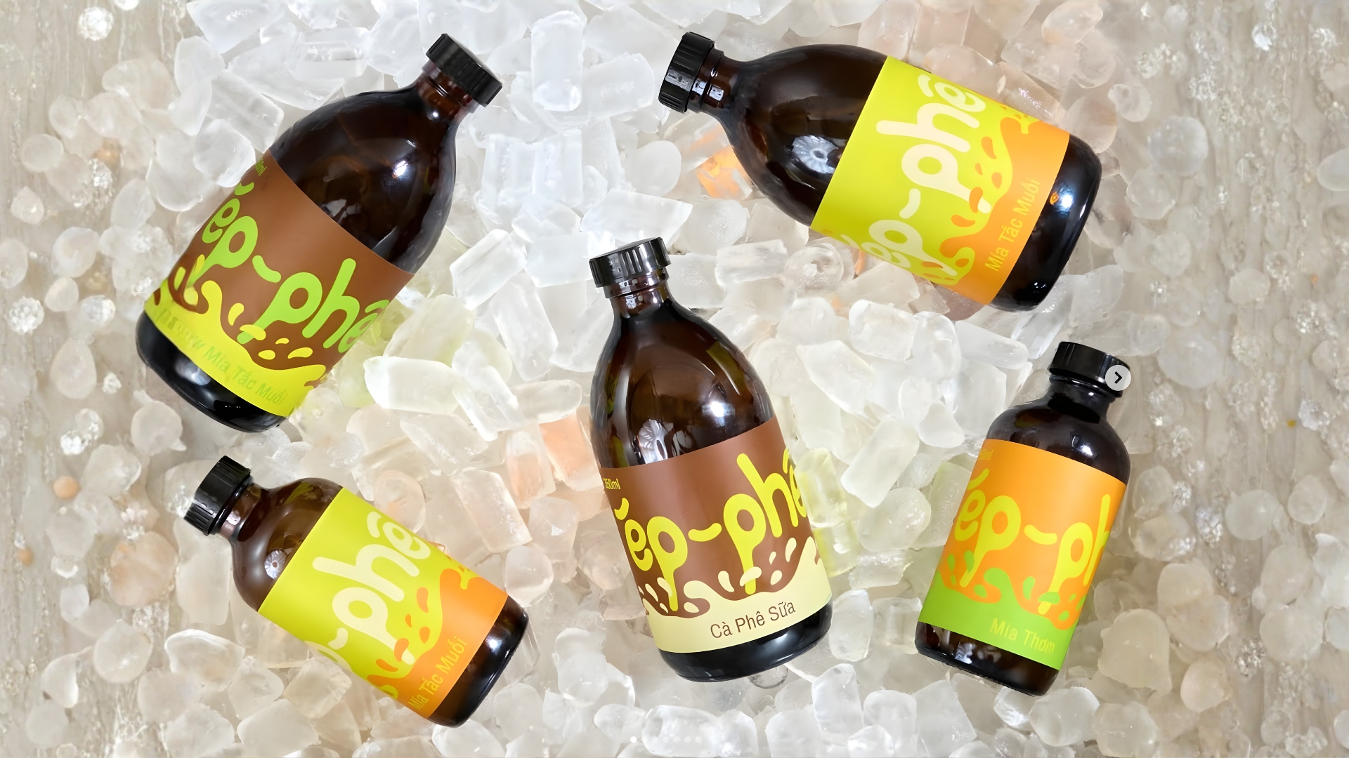
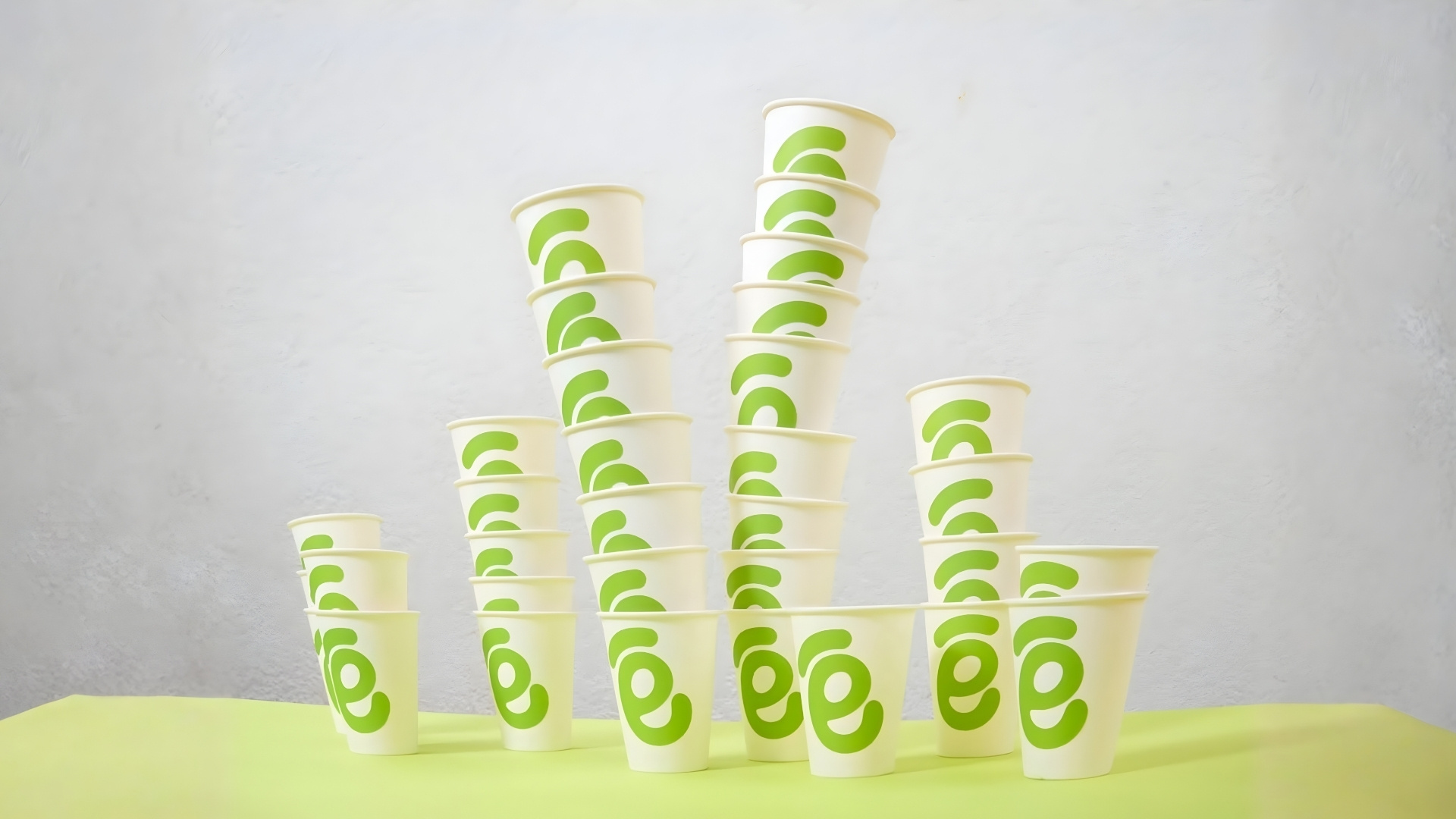
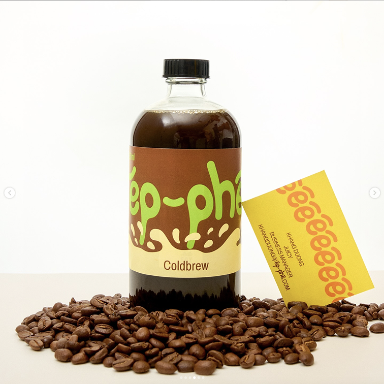
The logotype and its hyper-extended version vibrate with over-the-top excitement, and amplify raw human emotions. Completing the identity is a logomark: a tree of stacked cups that transforms into a stylized sugarcane stalk. Playful, loud, and brilliantly distinct, every touchpoint screams Ép Phêêêêê.



Creative director and Designer: Tú Lê
Brand strategist: Kai Nguyễn
Documentation: Lộc Huỳnh
Art & Product stylist: Kai Nguyễn
Art assistant: Thùy Trang
Producer: Khôi Nguyễn
Animation: Vian Nguyễn
Talents: Rob, Leandro, Hồng Khang